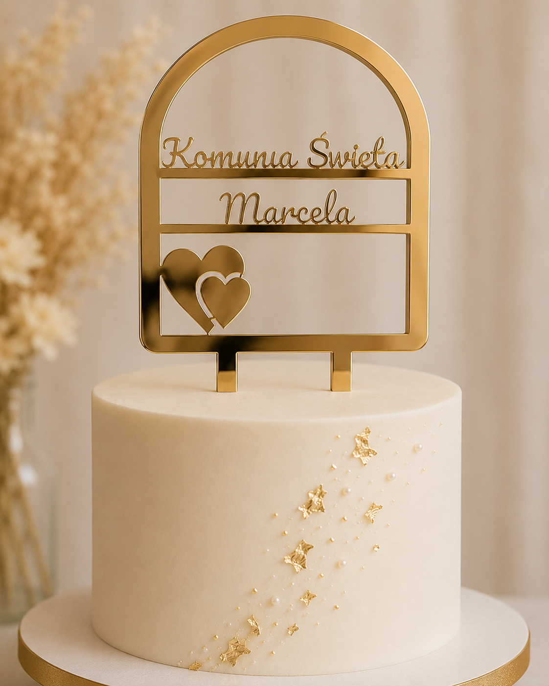
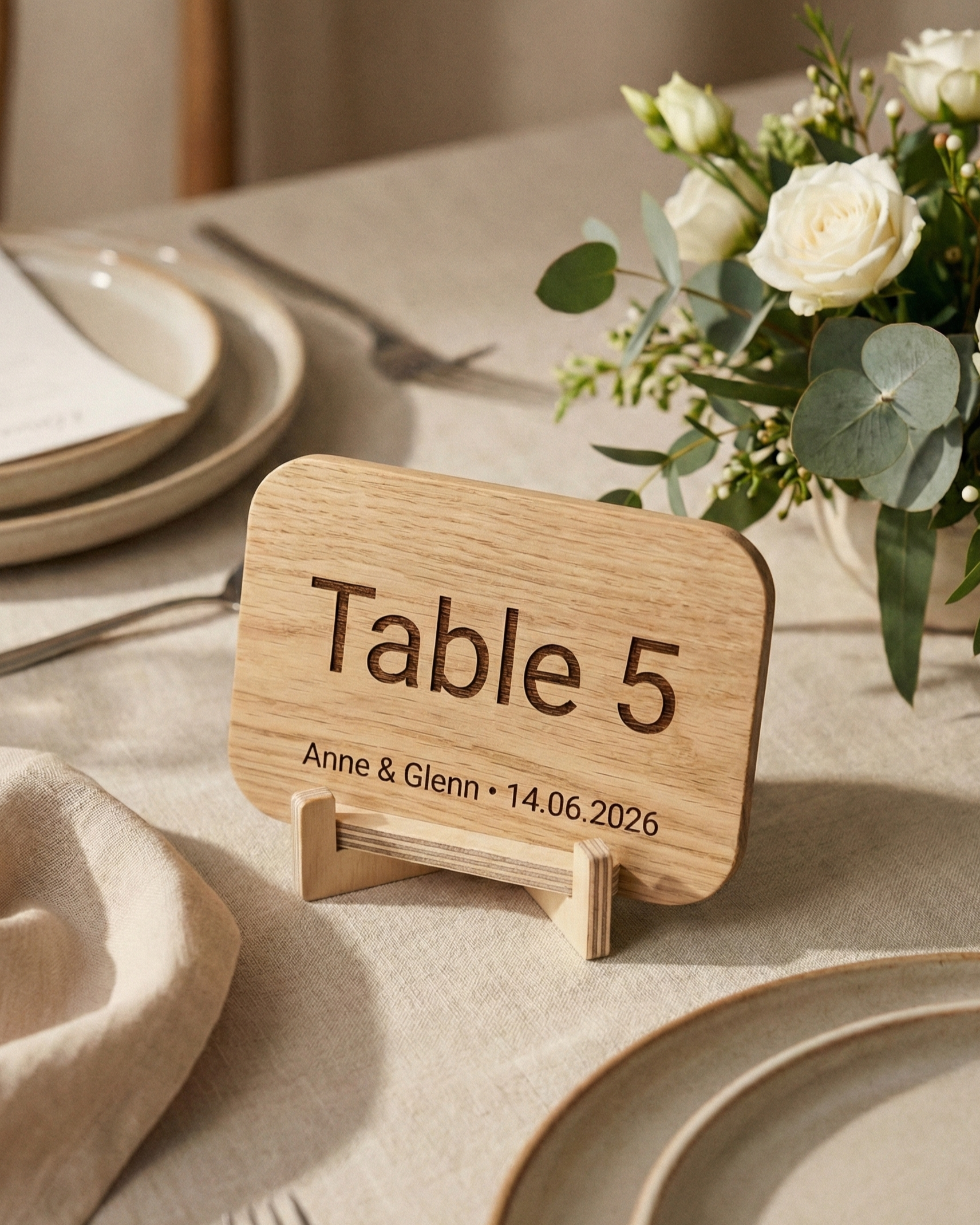
Start with what guests should understand first when they see the cake, then choose a material that stays visible against the cake and supports the style of the celebration. A short name, age, date, initials, two names or one concise phrase normally creates a clearer cake topper than several competing details.
AtaNova’s Personalised Cake Topper — Custom Text is available in Natural Wood, White Acrylic, Gold Mirror Acrylic and Black Acrylic. This guide focuses on how to choose the wording, contrast and visual direction. For the exact physical product, approximate size, what is included, care, safety and ordering facts, use the Personalised Cake Topper Buying Guide.
1. Decide what guests should notice first
Choose one main message before thinking about material or decoration. The wording should answer one simple question: what is this cake celebrating?
- Birthday: a name, an age or both
- Wedding or engagement: two names, initials, a shared surname or one short phrase
- First Communion, Confirmation or baptism: a name, the occasion or an optional date
- Baby shower or first birthday: a name, a welcome phrase or the first age milestone
- Anniversary: names, initials, a date or the number of years
If several details matter, keep the most important one on the topper and move secondary information to invitations, signs or cards.
2. Keep the wording compact
Shorter wording normally gives the layout more space and makes the message easier to recognise in person and in photographs. A complete sentence is rarely necessary.
- Prefer one central message over several small messages.
- Do not repeat information that the cake design already makes obvious.
- Choose deliberately between “and” and “&”.
- Use one consistent date format.
- Keep surnames, titles and name order exactly as required.
3. Check every character before layout
Personalised production follows the wording you submit and approve. Check names, ages, dates, capital letters, accents, punctuation, hyphens and special characters before approving the Design Proof.
If the wording is multilingual, decide the exact language and spelling before the layout is prepared. Avoid mixing languages unless that is an intentional part of the design.
4. Choose the material by contrast first
The best material is not simply the one that matches the event colour palette. It should also remain visible against the icing, flowers and background.
Natural Wood
Choose Natural Wood for a warm, understated and natural look. It works well with neutral cakes, botanical styling, greenery, dried flowers and rustic settings.
White Acrylic
Choose White Acrylic for a clean, bright and modern result. It is particularly useful on chocolate, darker or strongly coloured cakes.
Gold Mirror Acrylic
Choose Gold Mirror Acrylic when the celebration already includes warm metallic details or when a reflective, festive focal point fits the setting.
Black Acrylic
Choose Black Acrylic for strong graphic contrast, especially on white, cream, pastel or brightly coloured cakes.
5. Check the full scene, not only the icing
A topper can contrast with the cake and still disappear against the background. Think about the wall, flowers, table styling and lighting behind the cake.
- Light cake + light background: Black Acrylic usually gives the clearest outline.
- Dark cake: White Acrylic can create a clean separation.
- Warm botanical setting: Natural Wood can connect naturally with the surrounding materials.
- Formal celebration with gold accents: Gold Mirror Acrylic can repeat the metallic detail without adding more wording.
6. Match the visual style without adding extra text
Personalisation comes from the right wording and material; it does not require a long phrase.
- Minimal and modern: a name, initials or one short phrase with White or Black Acrylic
- Warm and rustic: a name or date with Natural Wood
- Elegant and festive: couple names, initials or a milestone number with Gold Mirror Acrylic
- Soft family celebration: a child’s name or age with Natural Wood or White Acrylic
- Bold and graphic: compact wording with Black Acrylic
7. Avoid the common choice mistakes
- too much wording;
- too little contrast with the cake or background;
- several competing messages;
- missed accents, punctuation or date details;
- assuming every reference layout works with every name or phrase;
- approving the Design Proof without checking every character.
8. Use the Design Proof as the final decision check
Before laser cutting, AtaNova sends a digital Design Proof by email. Review the spelling and also ask whether the main message is immediately clear, the layout feels balanced and the selected style fits the cake.
A small adjustment can be requested before production begins. Once the approved design has entered production, the personalised wording can no longer be changed. The topper is then made to order in our atelier in Antwerp.
Quick decision checklist
- What should guests understand first?
- Can any word be removed without losing the message?
- Are spelling, date, accents and punctuation exact?
- Which material gives enough contrast with both cake and background?
- Does the visual style fit the wider celebration?
- Have you checked every character on the Design Proof?
Once these decisions are clear, use the buying guide for the physical product and ordering facts, then place the final wording on the cake topper product page.
Frequently Asked Questions
What should I write on a cake topper?
Choose one main detail such as a name, age, date, initials, two names or a short occasion phrase. Shorter wording is usually clearer.
Which material gives the strongest contrast on a light cake?
Black Acrylic usually gives the strongest graphic contrast on white, cream or pastel cakes.
Can I use accents and special characters?
Yes. Enter them exactly as they should appear and check them carefully on the Design Proof.
Should the topper exactly match the event colours?
No. Clear contrast with the cake and background is more important than an exact colour match.
Will I see the layout before laser cutting?
Yes. A digital Design Proof is sent by email before laser cutting so the wording and layout can be checked.