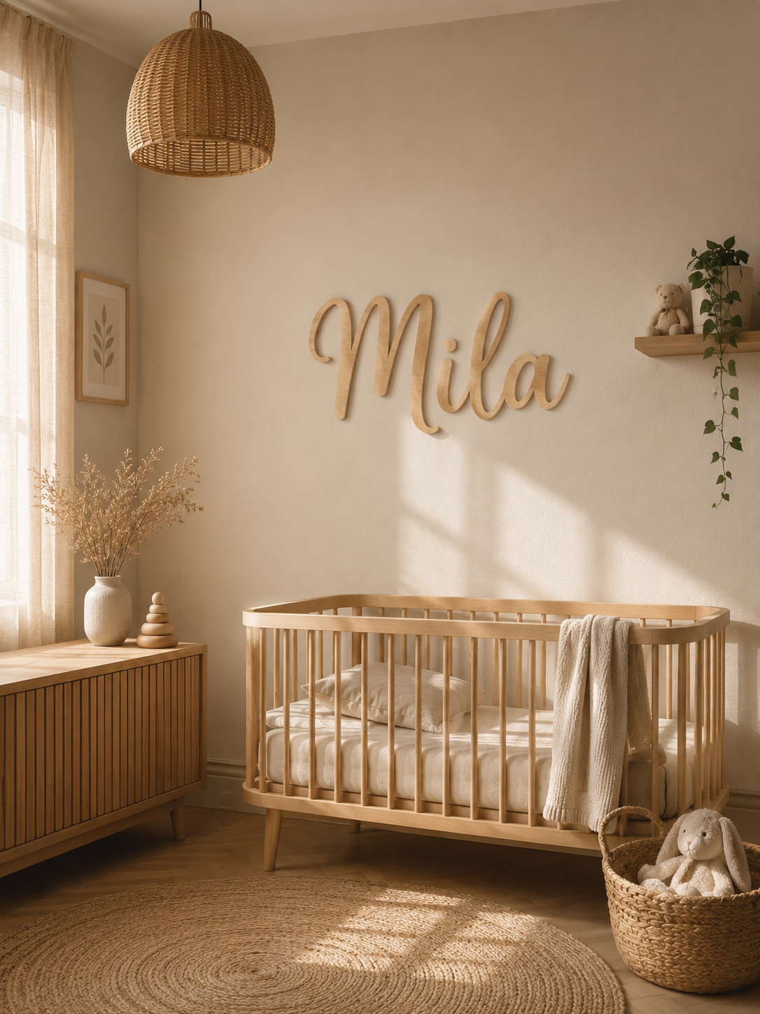
How to Choose the Right Font and Placement for a Nursery Name Sign
Choose a nursery name sign font by looking at the complete name, not at a single sample letter. Minimalist Sans gives the clearest and most modern result, Classic Serif adds a traditional and refined character, and Handwritten Script creates a softer, more decorative appearance. For placement, choose a visible section of wall with enough empty space around the sign, clear contrast behind it and no risk of the child reaching or pulling it.
The name, font, width, material and wall position should be selected together. AtaNova’s Nursery Name Sign — Wood & Acrylic is available in approximate widths of 30 cm, 45 cm and 60 cm, with three font styles and three material options. A digital Design Proof is sent by email before production so the complete name, spelling, font and layout can be reviewed before laser-cutting begins.
Which Font Is Best for a Nursery Name Sign?
There is no single font that is best for every nursery name sign. The correct choice depends on the child’s actual name, the number and shape of its letters, the selected sign width and the visual style of the room.
A suitable font should:
- keep the full name easy to recognise;
- create balanced spacing between the letters;
- remain clear at the selected sign width;
- match the room without competing with existing decor;
- continue to suit the child as the nursery becomes a bedroom.
The AtaNova Nursery Name Sign offers three font directions: Minimalist Sans, Classic Serif and Handwritten Script. Each produces a different result even when the same name, width and material are selected.
Minimalist Sans: Best for Clear and Modern Nursery Decor
Minimalist Sans uses clean letterforms without decorative finishing strokes. It is normally the easiest option to read from across the room and the most adaptable choice for a nursery that may later become an older child’s bedroom.
Choose Minimalist Sans for:
- modern or Scandinavian nursery interiors;
- white, beige, grey or neutral colour palettes;
- longer names that require controlled spacing;
- bedroom doors and compact wall areas;
- gallery walls that already contain several decorative elements;
- a name sign intended to remain suitable as the child grows.
This style is particularly useful when the wall already includes wallpaper, shelves, framed prints or patterned textiles. The simple letter shapes add personalisation without making the room visually crowded.
Minimalist Sans is also the most dependable option when readability is more important than decorative detail.
Classic Serif: Best for an Elegant and Timeless Look
Classic Serif uses small finishing strokes at the ends of the letters. These details give the name a more structured, traditional and refined appearance.
Choose Classic Serif for:
- traditional or vintage-inspired nurseries;
- floral, botanical or storybook room themes;
- rooms with classic furniture or wall panelling;
- an elegant newborn, christening or naming gift;
- parents who want decorative lettering without connected script letters.
Classic Serif normally creates more visual character than Minimalist Sans while keeping every letter separate and recognisable. It is therefore a useful middle option between clean modern lettering and flowing script.
The small finishing strokes remain most visible when the sign has adequate contrast with the wall and enough surrounding space.
Handwritten Script: Best for a Soft and Personal Effect
Handwritten Script uses flowing, expressive and sometimes connected letterforms. It can make the child’s name feel especially personal and decorative.
Choose Handwritten Script for:
- soft, warm or romantic nursery interiors;
- boho and nature-inspired rooms;
- short or medium-length names;
- a feature wall where the name is the main decoration;
- baby shower or newborn gifts intended to feel gentle and expressive.
Script should always be reviewed using the complete name. Some combinations of letters connect naturally, while others may create narrow gaps, large loops or a shape that is harder to read.
A decorative script is successful only when the full name remains recognisable. The purpose of the font is to support the name, not to hide it inside elaborate letterforms.
Choose the Font Using the Complete Name
A font sample may show only one capital letter or a short example word. That is not enough to predict the final sign. The customer’s complete name determines the actual width, height, spacing and silhouette.
Review these points before approving a font:
- Can every letter be recognised immediately?
- Does the capital letter overpower the rest of the name?
- Do repeated letters create an uneven section?
- Do script connections remain clear?
- Are accents and special characters correctly positioned?
- Does the name remain balanced within the selected width?
AtaNova adjusts spacing and proportions according to the name, selected font and chosen width. The Design Proof shows the actual layout before production so the customer can check the complete result rather than relying on a generic preview.
How Name Length Affects the Font Choice
Short names
Names with three or four letters have more available space within the selected width. They can normally support wider spacing, a stronger capital letter and more decorative serif or script forms.
A very short name may appear visually small when placed alone on a large wall. In that situation, a more expressive font or a larger width can create a stronger focal point.
Medium-length names
Medium-length names generally work with all three font styles. The choice can therefore focus more heavily on room style, desired character and material contrast.
Long names
Longer names require more horizontal space. Minimalist Sans often preserves the strongest readability because it does not add unnecessary decorative width.
When a long name looks compressed at approximately 30 cm, selecting 45 cm or 60 cm is usually more effective than forcing the letters into a smaller layout.
Two names or a second line
A second name or short second line changes the composition significantly. It should be entered as a special layout request and reviewed on the Design Proof. The available wall area should also be checked because a multi-line design may need more height than a single name.
How Letter Shapes Affect the Final Sign
Names with the same number of characters do not always occupy the same visual width. Narrow letters such as I and L require less space than wider letters such as M and W.
Other combinations can also affect the final balance:
- repeated narrow letters may make one section look compressed;
- repeated wide letters may make the name feel visually heavy;
- large script capitals may increase the overall height;
- letters with descending strokes may extend below the main line;
- accents may require additional space above the letters;
- hyphens and apostrophes can change spacing between name sections.
This is why sign width is approximate and height changes naturally according to the name, font and number of characters.
Enter Capital Letters and Special Characters Correctly
Capitalisation changes the complete appearance of a name. The same text can look substantially different in lowercase, title case or all capitals.
Enter the name exactly as it should appear, including:
- capital and lowercase letters;
- accents;
- hyphens;
- apostrophes;
- punctuation;
- special characters;
- characters from the required language or alphabet.
Do not assume that spelling, accents or capitalisation will be corrected automatically. Check the submitted personalisation and the Design Proof carefully before approval.
Match the Font to the Nursery Style
Modern or Scandinavian nursery
Choose Minimalist Sans. Its clean lines work with neutral walls, simple furniture and uncluttered decor.
Traditional or vintage nursery
Choose Classic Serif. The finishing strokes add a refined quality that suits traditional furniture, floral patterns and storybook-inspired rooms.
Boho or nature-inspired nursery
Choose Handwritten Script or Classic Serif in Natural Wood. Both options complement warm materials and organic room styling.
Monochrome children’s bedroom
Choose Minimalist Sans in Black Acrylic. This combination produces a strong outline and can remain suitable as the child grows.
Elegant feature wall
Choose Classic Serif or a carefully balanced Handwritten Script in Gold Mirror Acrylic. Keep the surrounding wall relatively simple so the reflective sign remains the focal point.
Colourful or patterned nursery
Choose the cleanest available lettering and prioritise strong contrast. A highly decorative font can become difficult to read when placed against busy wallpaper or several competing colours.
Match the Font to the Material
Font and material should be selected together because the material changes the visual weight, contrast and mood of the letters.
Natural Wood
Natural Wood creates a warm and understated result. It works with all three fonts and is particularly suitable for neutral, Scandinavian, boho and nature-inspired rooms.
Because wood is a natural material, grain and tone can vary slightly. It should be treated as a complementary warm material rather than an exact colour match to existing furniture.
Black Acrylic
Black Acrylic creates the strongest outline on light walls. It works especially well with Minimalist Sans and can give Handwritten Script a more graphic, modern appearance.
Gold Mirror Acrylic
Gold Mirror Acrylic creates the most reflective and decorative effect. Its appearance changes with surrounding light and colours. Classic Serif or Handwritten Script can make it feel more ornamental, while Minimalist Sans keeps the result visually controlled.
For a broader comparison of size, material and general configuration, read the Nursery Name Sign Buying Guide.
What Size Works Best With Each Font?
The listed sizes refer to approximate width. Final height depends on the selected name and font.
Approximately 30 cm
Choose approximately 30 cm for:
- bedroom doors;
- small nursery corners;
- compact wall areas;
- gallery walls;
- a subtle personalised detail.
Minimalist Sans normally remains easiest to read at this width, especially for medium-length or longer names.
Approximately 45 cm
Choose approximately 45 cm for:
- many standard nursery walls;
- a wall above a dresser or changing table;
- medium-length names;
- a balanced result that is visible without dominating the room.
This middle width works well across all three font styles and is generally the most flexible choice.
Approximately 60 cm
Choose approximately 60 cm for:
- large open walls;
- longer names;
- a strong nursery feature wall;
- decorative script that needs enough room to remain clear;
- a name intended to be visible from across the room.
A larger width does not automatically create a better result. It should still leave enough empty wall space around the name.
Measure the Wall Before Choosing the Placement
Do not choose a wall position based only on a styled product photograph. Measure the actual space in the room.
- Measure the usable wall width.
- Exclude curtains, shelves, lamps, sockets and furniture edges.
- Mark the intended 30 cm, 45 cm or 60 cm width with removable painter’s tape.
- View the marked area from the room entrance.
- Check it again from the centre of the room.
- Confirm that enough empty wall remains on every side.
The sign does not need to be exactly as wide as the furniture below it. A composition normally looks calmer when the name is narrower than the dresser, shelf or wall section supporting it visually.
Where Should a Nursery Name Sign Be Placed?
The best position is a clear section of wall where the name is visible, balanced and safely outside the child’s reach.
Suitable positions include:
- a nursery feature wall away from the cot;
- above a dresser or changing table when safely out of reach;
- beside a reading corner;
- on a coordinated gallery wall;
- above an older child’s bed when securely installed;
- on a bedroom door.
The exact position should be based on wall size, furniture layout, visibility and child safety rather than on a fixed universal height.
Feature Wall Placement
A feature wall gives the name enough open space to work as a standalone decoration. This is often the strongest choice when the sign should define the room without being surrounded by several other pieces.
Place the name where it remains visible from the doorway and does not compete with curtains, shelving or strongly patterned wallpaper.
An approximately 45 cm or 60 cm sign often works well on a larger feature wall, depending on the name length and available space.
Placement Above a Dresser or Changing Table
A dresser or changing table provides a clear visual reference for centring the sign. The name can be aligned with the centre of the furniture while remaining narrower than the full furniture width.
Before choosing this position:
- check whether the furniture may later be moved;
- leave enough wall space between the furniture and sign;
- keep the sign outside the child’s reach;
- avoid placing it where standing on the furniture would make it reachable;
- use a secure mounting method suitable for the wall and material.
Approximately 30 cm can suit a compact dresser, while approximately 45 cm often creates a more visible and balanced result.
Placement Beside a Reading or Play Corner
A name sign can define a reading, play or relaxation area without becoming the main decoration of the entire bedroom.
Minimalist Sans often works well in an active area because it remains clear beside books, toys and other visual elements. Natural Wood can help the sign blend gently into the room, while Black Acrylic creates stronger contrast.
Position the sign above normal reach and do not mount it where furniture can be used by a child to climb towards it.
Gallery Wall Placement
A nursery name sign can be combined with framed prints, photographs or milestone images. It should have a clear role in the arrangement rather than being forced into the smallest remaining gap.
For a balanced gallery wall:
- choose one main focal point;
- leave visible space between the name and surrounding frames;
- repeat at least one material or colour elsewhere in the arrangement;
- use a cleaner font when the other elements are visually detailed;
- avoid placing several competing script styles together.
An approximately 30 cm sign is often suitable when the name forms one part of a larger gallery arrangement.
Bedroom Door Placement
A bedroom door is a practical position when the sign should identify the child’s room rather than act as a large wall feature.
Approximately 30 cm is the most suitable AtaNova width for many doors and compact areas. Minimalist Sans normally offers the strongest readability when the name is viewed while walking past the room.
Check that the chosen mounting method is suitable for the door surface and that the sign will not interfere with the handle, frame or movement of the door.
Should a Name Sign Be Hung Above a Baby’s Cot?
For a baby’s sleeping area, the safest design choice is to place the hard wall sign on another wall rather than directly above the cot.
A nursery photograph may show a name positioned above a cot, but the visual arrangement should not override safety. A laser-cut name sign is decorative wall art, not a toy, and a hard object above the sleeping area could become hazardous if it loosens, falls or becomes reachable.
Safer alternatives include:
- an adjacent feature wall;
- the wall above a dresser positioned away from the cot;
- a reading corner;
- a bedroom door;
- a gallery wall outside the child’s reach.
Keep the cot away from cords, curtains, shelves and objects the child may later reach. Reassess the room as the baby grows, begins standing and can access higher areas.
How High Should the Sign Be Mounted?
There is no universal mounting height because furniture, wall proportions and child access differ between rooms.
Use this process:
- Mark the approximate sign width with painter’s tape.
- Centre it relative to the intended wall section or furniture.
- Leave clear space below and around the lettering.
- View the position from the doorway.
- Confirm that the name remains readable from normal standing distance.
- Check whether nearby furniture could allow the child to reach it.
- Consider how the room will change as the child grows.
The best height is the point where the sign feels visually connected to the room while remaining securely beyond the child’s reach.
Choose Enough Contrast Behind the Name
A readable font can still disappear if the material and wall colour are too similar.
- Natural Wood creates soft contrast on white, beige and muted coloured walls.
- Black Acrylic creates strong contrast on light walls.
- Gold Mirror Acrylic changes according to reflected light and surrounding colours.
- Minimalist Sans normally creates the clearest visual edge.
- Handwritten Script requires enough contrast for thinner and connected sections to remain visible.
Test the intended material against the actual wall colour during daylight and evening light. Reflective acrylic may appear substantially different depending on the room.
Common Font Selection Mistakes
Choosing from one attractive capital letter
A single sample letter cannot show how the complete name will look. Always review the full word.
Using decorative script for a very long name
Decorative connections can make a long name appear compressed. A cleaner font or larger width may create a stronger result.
Ignoring the child’s future bedroom
A highly nursery-specific design may not suit the room later. Minimalist Sans and Black Acrylic usually create the most adaptable combination.
Forgetting capitalisation and accents
Incorrect text changes both the spelling and the physical layout. Enter every detail exactly as required.
Selecting a font that competes with the wallpaper
Detailed wallpaper normally needs simpler lettering. The sign should remain easy to distinguish from the background.
Common Placement Mistakes
Ordering before measuring the wall
Product images cannot show the proportions of the customer’s room. Mark the intended width before ordering.
Using a sign that fills the entire wall area
The name needs visible breathing space. Avoid placing it too close to curtains, shelving, frames or furniture edges.
Hanging the sign directly above the cot
A hard decorative object should not be treated as part of the baby’s sleep space. Choose another wall where possible.
Mounting the sign within climbing reach
Consider drawers, chairs, toy boxes and other furniture that may allow a toddler to reach a previously inaccessible sign.
Ignoring future furniture changes
The cot may be lowered, the changing table may be removed and a toddler bed may later replace the original furniture. Select a wall position that can remain practical over time.
Using an unsuitable mounting product
Mounting materials are not included. Use a method suitable for the wall surface, sign material and weight, and follow the mounting product manufacturer’s instructions.
Why the Design Proof Matters
The Design Proof is the final opportunity to see the actual name in the selected font before the material is cut.
Check:
- the exact spelling;
- capital and lowercase letters;
- accents and punctuation;
- the selected font;
- the spacing between letters;
- the balance of the complete name;
- any requested second line or small layout adjustment.
Production begins after approval. Changes may no longer be possible after the approved design has entered production.
Quick Font and Placement Guide
- Modern neutral nursery: Minimalist Sans in Natural Wood.
- Modern high-contrast room: Minimalist Sans in Black Acrylic.
- Traditional nursery: Classic Serif in Natural Wood.
- Soft boho feature wall: Handwritten Script in Natural Wood.
- Elegant decorative wall: Classic Serif or Handwritten Script in Gold Mirror Acrylic.
- Long name: Minimalist Sans at approximately 45 cm or 60 cm.
- Bedroom door: Approximately 30 cm with clear lettering.
- Large open feature wall: Approximately 60 cm with sufficient empty space.
- Baby’s sleeping area: Use an adjacent wall rather than directly above the cot.
Nursery Name Sign Selection Checklist
- Enter the name exactly as it should appear.
- Check capitalisation, accents and special characters.
- Choose a font that keeps the complete name readable.
- Match the font to the room rather than to a sample image alone.
- Measure the usable wall space.
- Mark the proposed width with removable painter’s tape.
- Choose approximately 30 cm, 45 cm or 60 cm.
- Select a material that contrasts with the wall.
- Choose a secure location outside the child’s reach.
- Avoid placing a hard decorative sign directly above the cot.
- Review the complete Design Proof before approving production.
Choose the Sign Around the Name and the Room
The best nursery name sign is not automatically the most decorative font or largest width. It is the combination in which the full name remains readable, the material works with the wall and the placement feels balanced and safe.
AtaNova prepares every Nursery Name Sign to order in its Antwerp atelier. Choose an approximate width of 30 cm, 45 cm or 60 cm, select Natural Wood, Black Acrylic or Gold Mirror Acrylic, and choose Minimalist Sans, Classic Serif or Handwritten Script. The actual name layout is sent by email for approval before production.
Create your personalised Nursery Name Sign
To compare the full range of children’s lamps, signs and keepsakes, explore the Personalised Baby & Kids Gifts collection.
Frequently Asked Questions
What is the best font for a nursery name sign?
The best font is one that keeps the complete name readable and matches the room. Minimalist Sans is clean and modern, Classic Serif is traditional and refined, and Handwritten Script is soft and decorative.
What is the easiest nursery name sign font to read?
Minimalist Sans is normally the easiest option to read because it uses clean letter shapes with limited decorative detail.
Is script or block lettering better for a nursery name sign?
Script creates a softer and more decorative appearance. Block or sans-serif lettering is normally clearer and can work better for long names and rooms intended to grow with the child.
Which font is best for a long child’s name?
Minimalist Sans is usually the most controlled option for a long name. Choosing approximately 45 cm or 60 cm can also prevent the letters from becoming too compact.
Which font is best for a traditional nursery?
Classic Serif suits traditional, vintage, floral and storybook-inspired nurseries because it adds decorative detail while keeping the individual letters clear.
Which font is best for a modern nursery?
Minimalist Sans is the strongest choice for modern, Scandinavian, neutral and monochrome rooms.
Does the length of the name affect the font choice?
Yes. Short names can support more decorative lettering, while longer names generally benefit from cleaner fonts and a larger width.
Should I choose the font before the material?
Choose them together. Natural Wood creates a warm result, Black Acrylic creates strong contrast and Gold Mirror Acrylic creates a reflective decorative effect.
Where should a nursery name sign be placed?
Suitable positions include a feature wall away from the cot, above a dresser when safely out of reach, beside a reading corner, on a gallery wall or on a bedroom door.
Should a nursery name sign be placed above the cot?
The safer choice is to place a hard decorative sign on another wall rather than directly above the cot. Choose an adjacent feature wall or another secure position outside the child’s reach.
How do I check whether the sign will fit the wall?
Measure the usable wall area and mark the proposed 30 cm, 45 cm or 60 cm width with removable painter’s tape before ordering.
How high should the name sign be mounted?
There is no universal height. Position it where it looks balanced, remains visible from normal viewing distance and stays outside the child’s reach, including from nearby climbable furniture.
Are mounting materials included?
No. Mounting materials are not included. Choose a secure mounting method suitable for the wall surface, sign material and weight.
Can I use accents or special characters in the name?
Yes. Enter the name exactly as it should appear, including accents, capitals, punctuation and special characters, then review them carefully on the Design Proof.
Will I receive a preview before production?
Yes. AtaNova sends a digital Design Proof by email before production so the spelling, font and complete layout can be checked.
How long do production and delivery take?
Production and preparation normally take 1–2 business days after Design Proof approval. AtaNova’s overall delivery target is 3–5 business days from the order date.