How to Choose the Right Text, Material and Size for a Wedding Welcome Sign
Choose a wedding welcome sign by working in this order: decide what guests must read, match the acrylic finish to the backdrop, then select a size based on viewing distance and venue scale. Short wording stays clearer, the right background improves contrast, and a properly sized sign remains visible without overpowering the entrance.
AtaNova’s Personalised Wedding Welcome Sign is made from premium 4 mm acrylic with raised gold mirror acrylic lettering. The standard options are clear, white or black acrylic in A3, A2 or A1, with a digital Design Proof sent before production.
Wedding Welcome Sign Decision in 30 Seconds
- Choose the text: use the couple’s names, wedding date and one short welcome line.
- Choose the finish: clear acrylic for a light layered look, white for clean contrast, or black for a stronger black-and-gold effect.
- Choose the size: A3 for close viewing, A2 for a typical entrance, or A1 for a large space or statement installation.
- Check the display: confirm the easel, backdrop, lighting, wind protection and exact placement before ordering.
The three choices should support one another. Longer wording requires more layout space. A transparent sign needs a controlled background. A sign viewed from farther away needs fewer words and a larger format.
What Should a Wedding Welcome Sign Say?
A wedding welcome sign should identify the celebration quickly. Guests usually need to recognise the couple, understand that they are at the correct ceremony or reception, and read the message without stopping at the entrance.
The Essential Information
- Names: first names, full names, a shared surname or married name.
- Wedding date: written in the exact format you want displayed.
- Welcome wording: one brief line that introduces the celebration.
Optional Information
- Venue name or city
- A short quote
- A family welcome line
- A bilingual or multilingual phrase
- A ceremony-specific or reception-specific message
Optional information should earn its place. Every extra line reduces the space available for the names and can make the design harder to read from a distance. Keep practical instructions, schedules, seating information and long quotations on separate signs.
Wedding Welcome Sign Wording Ideas
The strongest wording follows a simple hierarchy: a short welcome line, the names as the main visual element, and the date as supporting information.
Classic Wording
- Welcome to the wedding of Emma & Lucas
- Welcome to our wedding
- Together with our families, we welcome you
- The wedding of Sophie & Matteo
Minimal Wording
- Emma & Lucas
- Welcome
- 14 September 2026
Modern or Personal Wording
- Welcome to our forever
- Our next chapter starts here
- Today, we celebrate love
Multilingual Wording
A bilingual sign can work well for an international wedding, but both versions should remain short. Use one shared set of names and date, then place the two welcome phrases above or below them. Submit accents, punctuation, symbols and non-English characters exactly as they should appear.
Before ordering, read the complete sign aloud. If the wording feels slow to say, it may also be slow to scan. The entrance sign should communicate in seconds.
How to Choose the Right Material and Acrylic Finish
For the standard AtaNova welcome sign, the structural material is premium 4 mm acrylic. The active choice is the acrylic base finish: clear, white or black. Every standard variant uses separate gold mirror acrylic letters that are laser-cut and applied by hand to create a raised 3D effect.
Clear Acrylic
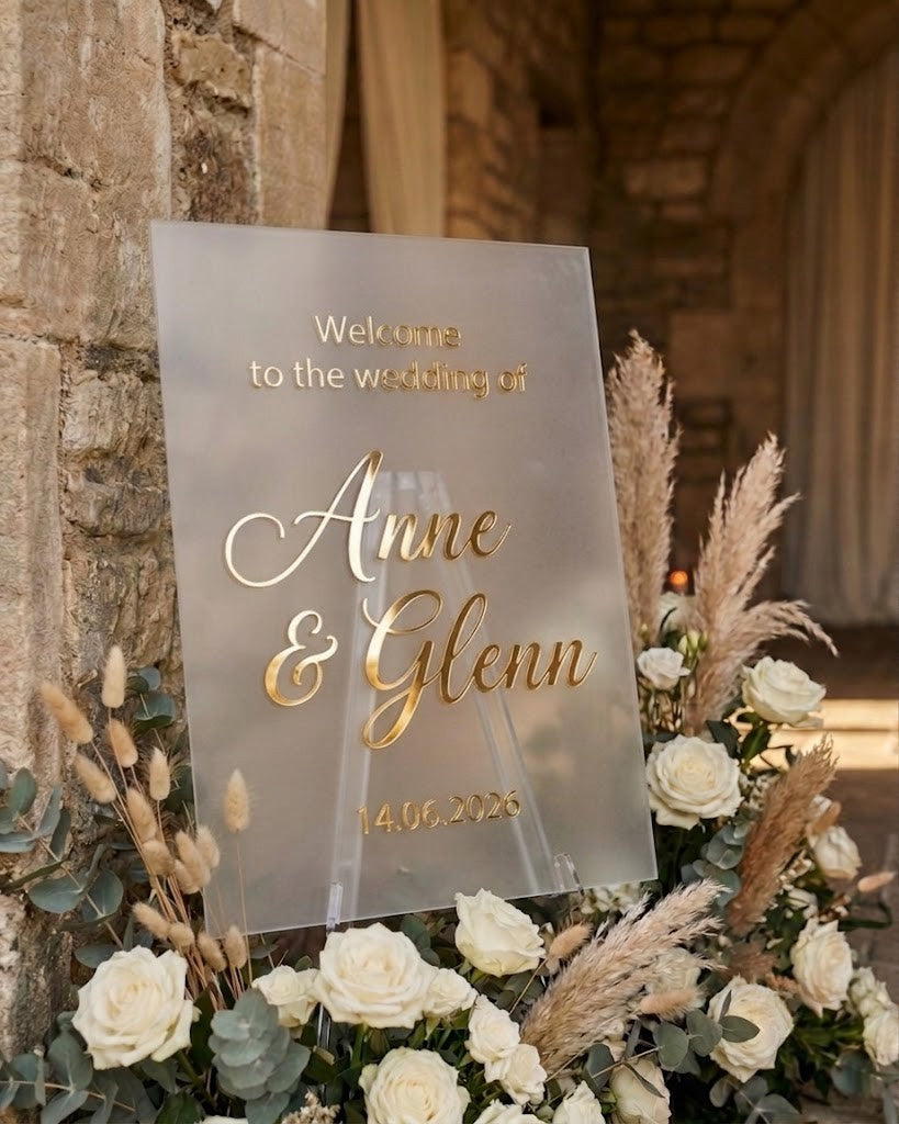
Choose clear acrylic when the backdrop is part of the design. Florals, greenery, fabric, stone or a styled wall remain visible behind the sign, creating a light and layered appearance.
- Works well with floral installations and textured backdrops.
- Keeps the entrance visually open.
- Needs a controlled background so the wording does not compete with busy details.
White Acrylic
Choose white acrylic when you want a clean, bright background and reliable contrast with gold lettering. It separates the text from the venue behind it and suits classic, romantic and light-coloured styling.
- Useful when the background is visually busy.
- Creates a clear border around the sign itself.
- Pairs naturally with white flowers, neutral linen and soft palettes.
Black Acrylic
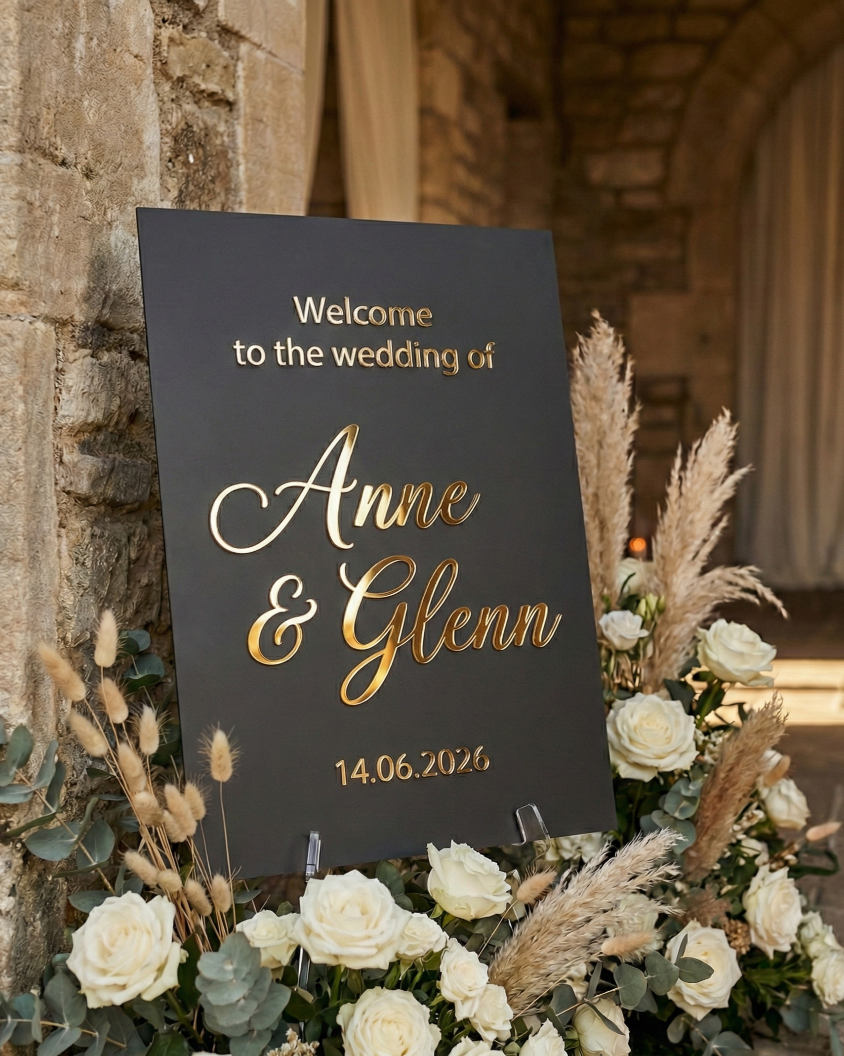
Choose black acrylic for a stronger black-and-gold contrast. It suits evening receptions, modern interiors and darker colour palettes where the sign should feel more graphic and defined.
- Creates the strongest contrast with gold mirror lettering.
- Works well in contemporary or evening settings.
- Can become a visual focal point rather than blending into the backdrop.
Why Raised Acrylic Lettering Changes the Finish
The wording is not printed and is not made with vinyl stickers. The gold mirror letters are separate acrylic elements, so they create physical depth and catch light from different angles. This makes the sign read as a finished wedding object rather than a flat poster.
How to Choose the Right Wedding Welcome Sign Size
Size should be based on where the sign will stand, how far away guests will first see it, and how much wording the layout must carry. Measure the available display area before choosing the sign and its easel.
| Size | Dimensions | Choose it for | Keep in mind |
|---|---|---|---|
| A3 | 30 × 40 cm | Intimate ceremonies, civil weddings, welcome tables and compact entrances | Best when guests approach closely and the wording is minimal |
| A2 | 40 × 60 cm | Standard ceremony or reception entrances and common venue layouts | A balanced default when the sign needs presence without dominating the setup |
| A1 | 60 × 80 cm | Large venues, spacious entrances, statement florals and displays viewed from farther away | Use short wording and a stable support suitable for the larger format |
Choose A3 When Guests Will Stand Close
A3 works when the sign sits on a welcome table, near a guest book or in a compact civil-ceremony entrance. It is not the right format for a large empty foyer or a distant outdoor arrival point.
Choose A2 for a Typical Entrance
A2 gives the names and date more visual presence while remaining practical for many standard easels and venue corners. It is the most flexible starting point when guests will see the sign from a moderate distance.
Choose A1 for Scale and Distance
A1 is designed for a larger visual field. Choose it when the entrance is spacious, the sign is part of a floral installation, or guests need to recognise it from farther away. Avoid filling the larger surface with unnecessary text; scale works best when the wording remains simple.
Match the Text, Finish and Size as One Design
A strong choice is not made by selecting each option separately. The wording, acrylic finish, size and venue backdrop should work as one system.
- Intimate civil ceremony: names and date, white acrylic, A3.
- Classic reception entrance: short welcome line, names and date, clear or white acrylic, A2.
- Large floral installation: very short wording, clear acrylic, A1.
- Modern evening reception: names, date and one short phrase, black acrylic, A2 or A1.
- International wedding: two brief welcome lines, one shared set of names and date, A2 or A1 depending on viewing distance.
These are decision examples rather than fixed rules. A clear sign can disappear against glass or a complex backdrop, while a black sign may feel too dominant in a very soft setting. Use the actual venue photographs, lighting and entrance dimensions when deciding.
Check the Display Before You Order
The easel or display stand is not included with the AtaNova welcome sign. Confirm the support separately and check that it is suitable for the selected A3, A2 or A1 format.
- Measure the display area: include flowers, fabric, furniture and guest circulation.
- Confirm the viewing distance: note where guests first see the entrance.
- Check the backdrop: decide whether transparency or a solid base creates better contrast.
- Check the lighting: consider daylight, candles, spotlights and reflections.
- Choose a stable support: the sign must sit securely without bending or slipping.
- Protect outdoor displays: use only in a sheltered position away from rain, strong wind and direct heat.
The sign is decorative event signage and is not intended for permanent or unprotected outdoor installation.
Use the Design Proof as a Final Accuracy Check
A digital Design Proof is emailed before production. This is the final stage for checking the names, wedding date, wording, punctuation, special characters, typography balance and line order.
- Compare every name with the invitation or official spelling.
- Check whether the date format matches the wedding stationery.
- Confirm capital letters, accents, ampersands and punctuation.
- Review the full layout at normal reading size, not only while zoomed in.
- Make sure the most important words are visually dominant.
- Request any small correction before approving production.
Production normally takes 1–2 business days after Design Proof approval and is included within AtaNova’s overall 3–5 business-day delivery promise from the order date when the proof is approved promptly. For wedding orders, ordering at least three weeks before the event gives additional planning time.
More details about approval and production are available on How It Works.
When a Custom Wedding Sign Is the Better Choice
The standard product covers three acrylic finishes and three sizes. A bespoke request may be more suitable when you need a different dimension, a seating plan, a bar sign, a menu sign, a guest book sign, a ceremony sign or a coordinated signage set.
Submit non-standard requirements through Custom Projects & Bespoke Orders. Include the event date, required dimensions, wording, quantity, preferred material and any reference images that explain the intended style.
Choose Your Personalised Wedding Welcome Sign
Start with the message guests must understand, select the acrylic finish that gives it enough contrast, and choose the size that suits the entrance rather than the table alone. This creates a sign that is readable, visually connected to the wedding and properly scaled for the venue.
Choose your Wedding Welcome Sign size and acrylic finish, or browse matching table numbers, save the date magnets, cake toppers and wedding keepsakes in the Wedding & Events collection.
Frequently Asked Questions
What should a wedding welcome sign say?
Use the couple’s names, wedding date and one short welcome phrase. A surname, venue, city, brief quote or second language can be added when it does not reduce readability.
Which material is available for the AtaNova Wedding Welcome Sign?
The standard sign uses a premium 4 mm acrylic base with raised gold mirror acrylic lettering. Choose a clear, white or black acrylic base finish.
What size wedding welcome sign should I choose?
Choose A3 at 30 × 40 cm for compact displays and close viewing, A2 at 40 × 60 cm for a typical ceremony or reception entrance, or A1 at 60 × 80 cm for large venues, statement installations and longer viewing distances.
Is A2 large enough for a wedding welcome sign?
A2 is a practical choice for many standard ceremony and reception entrances. Choose A1 when the space is large, the display is viewed from farther away or the sign forms part of a statement floral installation.
Can the sign include bilingual or multilingual wording?
Yes. Wording can be submitted in different languages or alphabets, including accents and special characters. Keep both language versions brief and enter every character exactly as it should appear.
Is an easel or display stand included?
No. The easel or display stand is not included. Use a stable support that is suitable for the selected A3, A2 or A1 sign size.
How early should I order a personalised wedding welcome sign?
Production normally takes 1–2 business days after Design Proof approval and is included within the overall 3–5 business-day delivery promise when approval is prompt. Ordering at least three weeks before the wedding is recommended for extra planning time.
Can I request a custom size or matching wedding signage set?
Yes. Different dimensions and coordinated pieces such as seating plans, bar signs, menu signs and ceremony signs can be requested through the Custom Projects & Bespoke Orders page.