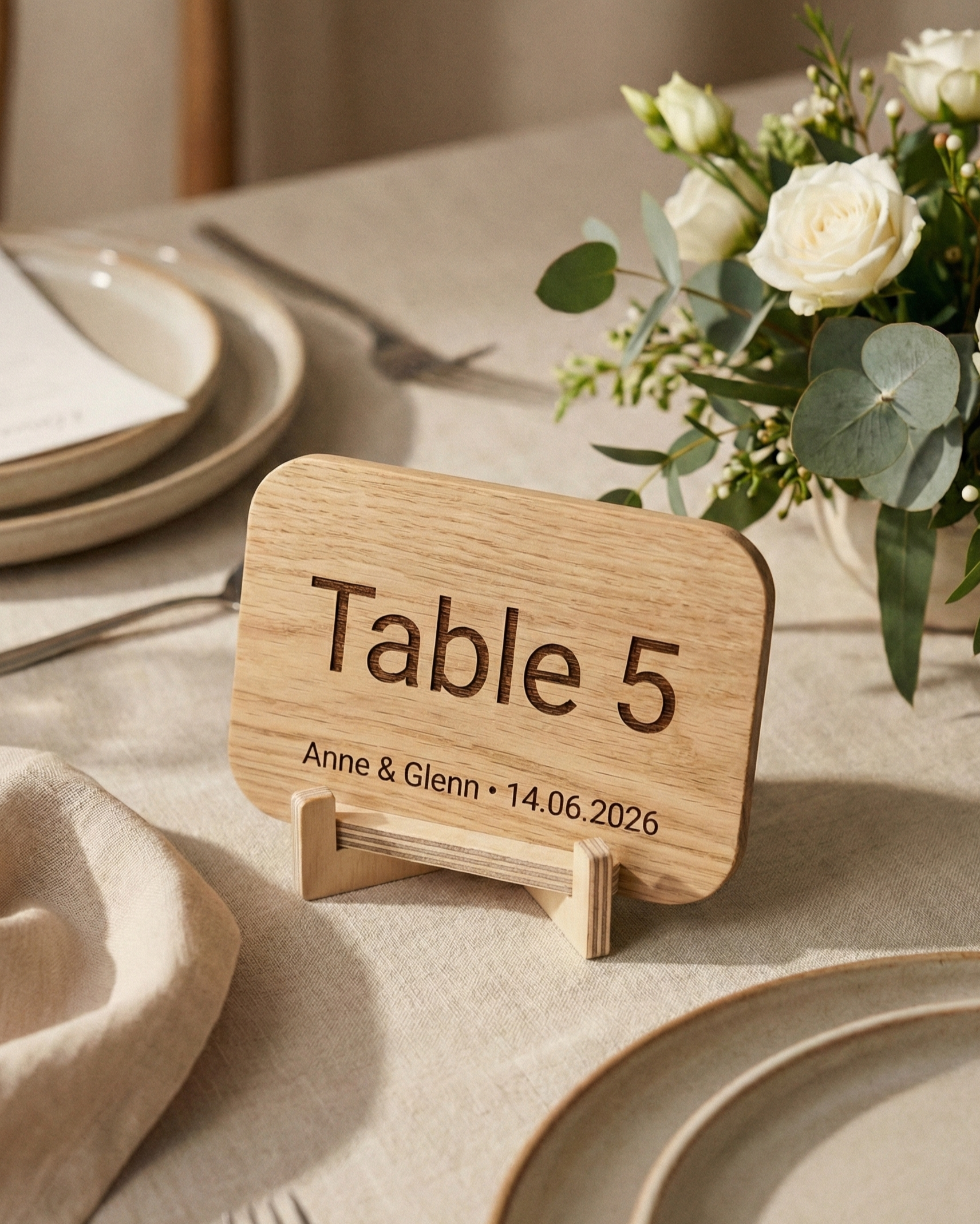
Coordinate wedding table numbers with your welcome sign by repeating only two or three visual decisions: one material or finish direction, one dominant colour or metallic accent, and one clear typography hierarchy. The pieces do not need to be identical. The welcome sign should establish the visual language at the entrance, while the table numbers continue it in a smaller, more functional form.
AtaNova’s Personalised Wedding Welcome Sign uses a 4 mm Clear, White or Black Acrylic base with individually laser-cut raised Gold Mirror Acrylic lettering. The Personalised Wedding Table Numbers are laser-engraved in Natural Wood, Clear Acrylic, Black Acrylic or Gold Mirror Acrylic and include a matching stand.
This guide is about coordinating the two products. For quantity, exact table-number options, size, stands and ordering facts, use the Wedding Table Numbers Buying Guide.
1. Coordinate, do not copy
Start by choosing the one or two features of the welcome sign that should continue through the reception. Exact construction does not need to match: the welcome sign uses raised gold lettering, while the table numbers are engraved.
- Material direction: transparent, dark, reflective metallic or natural
- Colour relationship: clear and light, white and gold, black and gold or warm natural tones
- Typography hierarchy: expressive names or main message, simpler supporting text and highly readable table identifiers
2. Let the welcome sign establish the entrance style
The welcome sign is available in A3 — 30 × 40 cm, A2 — 40 × 60 cm and A1 — 60 × 80 cm. Every active version has raised Gold Mirror Acrylic lettering on a Clear, White or Black Acrylic base.
Choose the strongest visual feature:
- Clear base: transparency and visual lightness
- White base: bright contrast with raised gold lettering
- Black base: dramatic black-and-gold contrast
- Any base: the gold lettering can become the metallic accent repeated at the tables
An easel or display stand is not included with the welcome sign, so the venue setup must provide a stable support suitable for the selected size.
3. Keep table numbers functional
Table numbers are approximately 15 × 20 cm in a vertical A5-style format. Their primary job is navigation: they must match the seating plan and remain visible between flowers, menus, glassware and other table details.
Do not force the table numbers to carry the same amount of information as the entrance sign. Let the welcome sign carry the couple’s names, date and welcome message. Let each table sign carry the exact number, written number, table name or short label guests need to find their seat.
4. Choose the material pairing from the feature you want to repeat
Clear welcome sign + Clear Acrylic table numbers
This is the lightest pairing. It works when flowers, fabric, stone or greenery should remain visually dominant. The raised gold lettering at the entrance can be echoed through smaller gold details elsewhere without making every sign metallic.
Clear or White welcome sign + Gold Mirror Acrylic table numbers
Use this pairing when the gold lettering is the main feature you want to repeat. Gold Mirror Acrylic table numbers create a direct metallic connection from the entrance to the reception tables.
Black welcome sign + Black or Gold Mirror Acrylic table numbers
Black table numbers repeat the dark base for a controlled graphic look. Gold Mirror Acrylic table numbers repeat the raised gold lettering more directly for a stronger black-and-gold reception.
Acrylic welcome sign + Natural Wood table numbers
This can work when wood already appears elsewhere in the venue, such as the easel, furniture, ceremony structure or botanical styling. The material difference should look intentional rather than accidental.
5. Use one table-label system from seating plan to table
The welcome sign and table numbers do not need the same wording, but the seating plan and table signs must use the same identifiers.
- If the seating plan says “Table 1”, keep “Table 1” on the sign.
- If tables use city or flower names, repeat the exact spelling and language.
- Use the same accents, punctuation and capitalisation.
- Keep special labels such as Sweetheart Table or Kids Table consistent.
Guests should not need to translate one naming system into another after reading the seating plan.
6. Coordinate typography through hierarchy
Typography can connect different materials without making every line look identical. Use one visual hierarchy across the signage:
- Main names or entrance message: the most expressive element
- Date or supporting wording: smaller and simpler
- Table identifiers: clear and immediately readable
Long quotes and too many decorative styles weaken the system. Keep the entrance emotional and the tables practical.
7. Match scale to viewing distance
The products serve different viewing distances, so they should not share the same physical scale. Choose A3, A2 or A1 for the welcome sign according to the entrance, backdrop and viewing distance. Keep the approximately 15 × 20 cm table signs visible without allowing them to dominate the centrepieces.
8. Check the actual venue background and light
- Clear acrylic: needs enough visual contrast behind it.
- Gold Mirror Acrylic: reflects windows, candles and directional light.
- Clear table numbers: can disappear among glassware or a busy centrepiece.
- All pieces: need stable placement away from open flames and direct heat.
- Outdoor events: use the signage only in a secure, sheltered position protected from rain and strong wind.
9. Review both Design Proofs as one system
Both products include a digital Design Proof before personalised production. Review them together rather than as isolated designs.
- Confirm the welcome-sign base, size, names, date and short wording.
- Confirm the final seating plan and table-label system.
- Choose the table-number material that repeats or supports the main entrance feature.
- Compare hierarchy, spacing, contrast and overall visual direction.
- Check spelling, accents, punctuation, number sequence and total table-sign quantity.
- Approve only after both pieces make sense within the same venue plan.
If a reasonable small correction is needed, request it before approval. Once an approved personalised design has entered production, those details can no longer be changed on the completed piece.
10. Keep delivery planning factual
Both standard products are made to order and use Design Proof approval before personalised production. The live product information states delivery within 3–5 business days. Review the Design Proofs promptly so the orders can proceed without avoidable delay.
If the event requires a non-standard signage size or a broader coordinated set such as seating plans, bar signs or menu signs, use Custom Projects & Bespoke Orders.
Coordination checklist
- One entrance style established
- One or two visual features chosen to repeat
- Table identifiers match the seating plan exactly
- Welcome-sign size matches the entrance viewing distance
- Table-number material stays visible against the table setting
- Easel or display support arranged separately for the welcome sign
- Both Design Proofs reviewed together
- Table-sign quantity checked against the final floor plan
Frequently Asked Questions
Do wedding table numbers need to match the welcome sign exactly?
No. Repeating two or three visual decisions is usually enough. The products have different functions and constructions.
Which table numbers work with a clear acrylic welcome sign?
Clear Acrylic creates the lightest pairing. Gold Mirror Acrylic repeats the raised gold lettering more directly. Natural Wood can also work when wood is repeated elsewhere in the venue.
Which table numbers suit a black-and-gold welcome sign?
Black Acrylic creates a controlled dark continuation; Gold Mirror Acrylic creates a stronger metallic connection.
Should the seating plan and table numbers use the same labels?
Yes. Use the exact same number, written number, table name or special label so guests can navigate without confusion.
How quickly are the products delivered?
The live standard product information states delivery within 3–5 business days. Prompt Design Proof review helps the orders continue without avoidable delay.
Explore more coordinated pieces in the Wedding & Events collection.